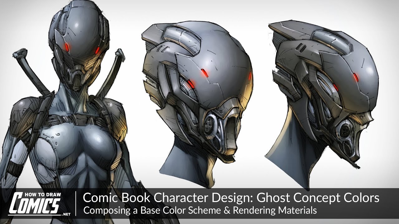
 In today’s video we’ll be coloring up the concept for Ghost, a character from Rob Arnold’s Replicator comic book series.
 Watch the previous Ghost Concept Art Tutorial here:
Check out the IndieGoGo for Replicator 1&2 here:
When it comes to coloring comic book characters the most important thing to understand is that the scheme must match their bio. In fact it’s the character’s story and background that’ll determine almost every visual element that makes them up, as they’re meant to convey precisely that – who your character is.
The better you get at doing this, the more convincing and believable your characters will be, because they’ll make sense.
In regards to coloring, it’s really the wrapping paper meant to present the character in their best light. A great colorist, just like a great inker, is able to compliment the initial line art of the concept, enhancing its final presentation and bringing it to a whole new level of quality.
This video will show you how to do exactly that as we begin by laying in the base colors, which are used to establish the core color scheme of the character. On the surface, this seems like a fairly straight forward step, and it is technically easy to execute as long as you keep each color inside the lines of the area you’re filling it.
But it’s actually much more complex than that. This is the point at which color theory must be considered as you decide what colors will sit well next to one another, and the kind of scheme that’ll be most suitable for your character. It’s the choice of colors that really need to be thought about here, and knowing which ones will be complimentary or clash is key to avoiding an undesirable base color palette.
After the flats are down it’s time to move onto the rendering stage of the comic book coloring process where we’ll use dark and light values to convey form and indicate lighting direction. This is simple enough as long as you keep in mind where the major light source is in the scene and from which direction it’s casting down onto the character from. That way you’ll be able to make a pretty good guess as to which side of the form will be lit, and where it’ll fall off into shadow.
The difficult part is figuring out how the light will bounce off of each one of these forms, depending on the material they’re made of or covered with. Materials greatly affect the intensity to which light will reflect off the surface of a given object, and so to convey those materials accurately this is something that needs to be considered carefully.
Mostly, the brightness of the highlight and its fall off across the form will be responsible for this. The way in which we depict this is through the intensity of the highlight and its blend from light into darker tones. A softer light to dark transition with a dimmer highlight would suggest a material which absorbs light while bouncing it back with a minimal amount of intensity. A stark transition with an intense specular highlight would convey the opposite – a reflective material that absorbs very little light.
I hope you get a ton of value out of today’s tutorial and that it gives you some insight into the approach I like to take when it comes to coloring comic book art. Thanks for watching, and if you enjoyed this video, be share to share it with you fellow art friends. They’ll be grateful you did and so will I!
Until next time – keep on creating, keep on practicing and I’ll see you in the next video!
-Clayton
Software Used: Photoshop
If you like the video, show your support by commenting, sharing or subscribing.
Comic Art Community -
How to Draw Comics .NET -
Instagram -
Facebook -
Twitter -
Tumblr -
Pinterest -


0 Comments